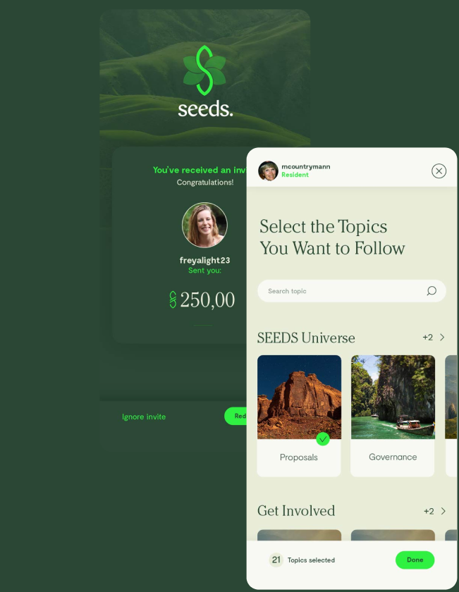
I was tasked with revamping the Seeds mobile app interface for their Seeds Wallet App. The primary task was to fix the branding to match their primary objectives while also fixing UX issues that were often brought up in user feedback forms.
Duration
6 months
January 22 - Junen 11
Role
UX Designer
Context
Seeds Wallet is a cryptocurrency wallet that serves as a storage for digital tokens (seeds). It is used by over 450 organizations and provides an economic system for business owners and individuals.
The challenge was to redesign the existing app so that the UI better represents the brand and its values. There were also multiple issues that were often brought up in user feedback forms and minor UX problems that needed clarification.


We had until June and I was to design a scalable solution that would accomodate additional plugins that were intended to be deployed after my contract.
Defining the design direction
The primary goals of this
project were to create a more visually consistent mobile
interface since the company's other app "Seeds Passport" had a
vastly different UI.
The 4 main pillars of this redesign were as follows.
Consistency
Meeting the expectations of the user by creating a consistent framework throughout the interfaces.
Navigation
An uninterrupted experience that tells a story while meeting users needs.
Presentation
A visually appealing layout that effectively impresses the user.
Memorability
A successful user journey throughout the user of the app the encourages recurring visits
Success Metrics
It’s important to set key aspects of user satisfaction so that knowing what to track and whether or not those goals are met can guide the direction for all design aspects.
Key touch points of the app:
Sign up
Meeting the expectations of the user by creating a consistent framework throughout the interfaces
Home screen
An uninterrupted experience that tells a story while meeting users needs
Send/Receive
A visually appealing layout that effectively impresses the user
Upgrade to Citizen
A successful user journey throughout the user of the app the encourages recurring visits
In order to validate the design, we reached the conclusion that the following success metrics were the most appropriate:
- Completed vs. incompleted transactions: Whether or not users completed the entire transaction process.
- Engagement and drop-off rate in the sign-up screen: Are users inclined to follow through with the improved sign-up process?
- User feedback form: The current feedback form has relatively negative feedback, an improvement is an easy to track metric.
Let’s take a look at the main screens and sign-up screens. All of the key tasks associated with the user feedback and transactions were situated in these screens so I looked at various iterations on these interfaces.


I looked at previous products for inspiration from the Seeds ecosystem and other moodboards that exemplified the theme of nature. I gravitated towards a technologically advanced yet environmentally focused interface. Something more appropriate for a web 3 application yet deeply rooted in nature.
Error code fix
Applying our research to the design
The first problem was a recurring one. Users often had this screen popup with only HTML text and no context on how the transaction had failed. The newly redesigned screen provides more context and a less intimidating transaction failed screen.


The first problem was a recurring one. Users often had this screen popup with only HTML text and no context on how the transaction had failed. The newly redesigned screen provides more context and a less intimidating transaction failed screen.
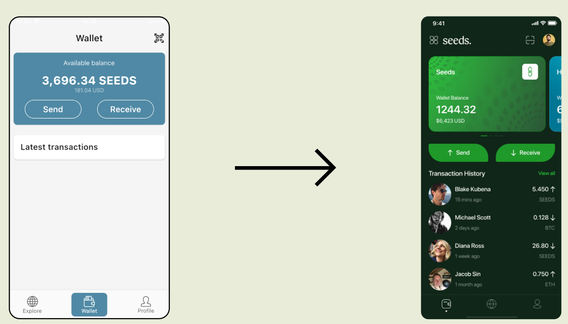
I simplified much of the global navigation while automatically expanding the transaction history. I also changed the UI to more closely fit the new branding.
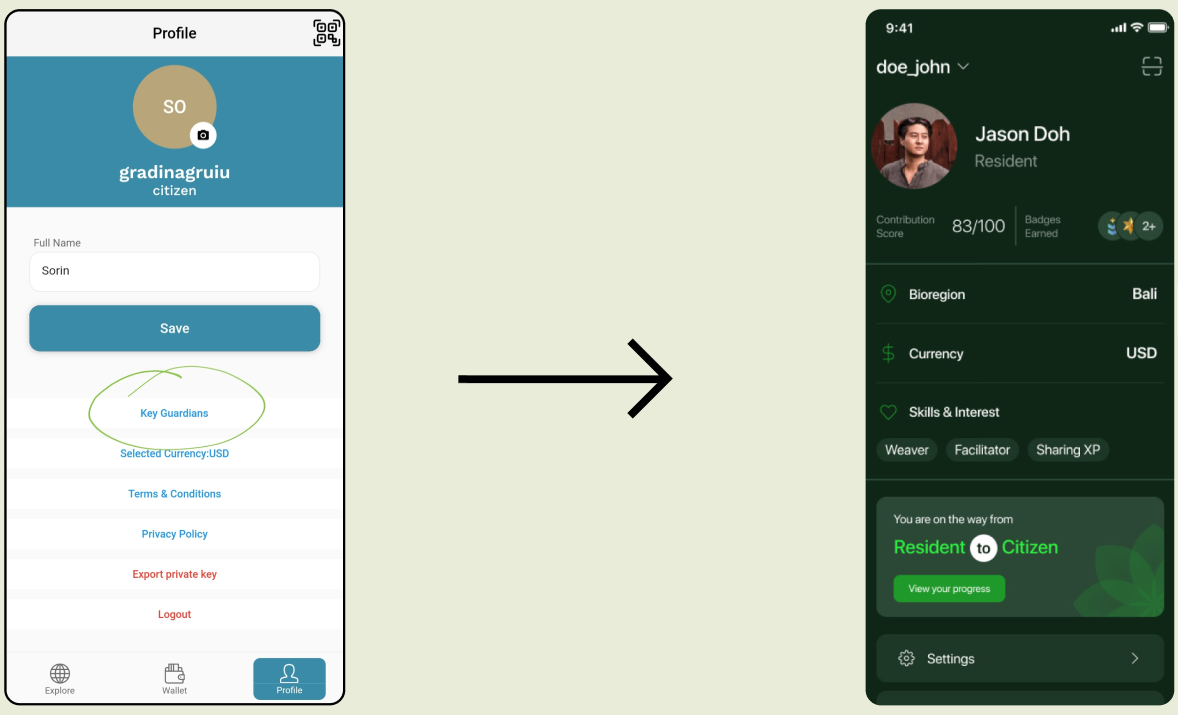
I added more detail to the UI so that it used a larger button sizes that we determined to be better from an accessibility standpoint, we justified this through our A/B testing.
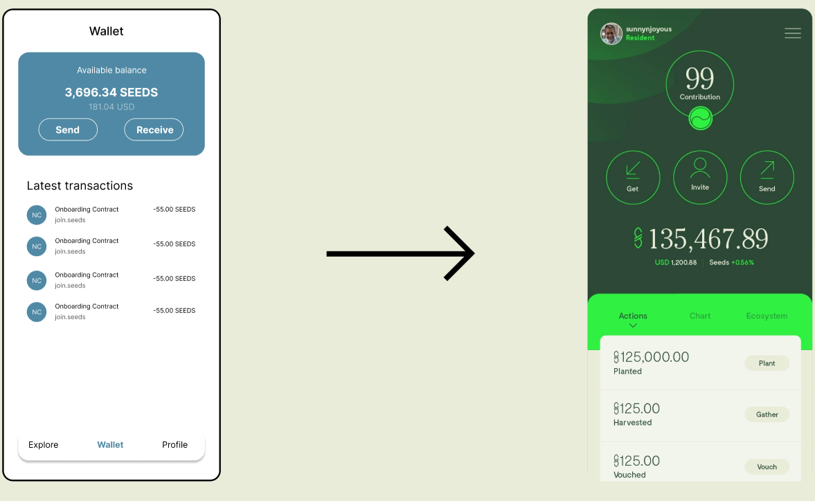
We wanted the design to feel more nature-themed and sustainable so we included shades of green which also symbolizes growth and prosperity. We also used a more unique serif font for our branding for a more elegant look.

We generated 12 word backup phrase within the app, before it was only generated in the seeds passport app, you needed 2 apps just to login


I created 2 different flows for potential A/B testing regarding the information architecture of the page. Using a clickable prototype created with Figma, some participants who often used the app went through the experience of entering and using the new app vs. the old one.
Documenting the findings and notes, I was able to group the quotes and insights from each user based on which step the user was on in the flow.
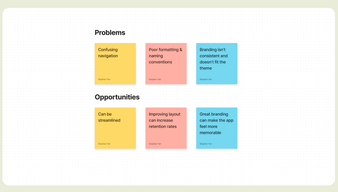
I found that
- Users found the previous flow much less effective and they took on average, 45% longer to complete vs. the new flow.
- The oversimplified layout of the old interface had inconsistent naming conventions and users were often confused where to find certain menus. Ie. Profile, transaction history

Overall positive Feedback
The redesign generated substantial positive feedback in the communication channels associated with Seeds. This resulted in an onboarding of 30+ partners/organizations following the redesign.
40,000 new downloads in 6 months
The newly redesigned app garnered enough attention through communication channels that we saw a 40,000 increase in users within 6 months.
The next steps for this project would be to continue testing and using the data that the live version provides. With further refinement, this app can be expanded to accomodate over a hundred additional organizations and can be leveraged in multiple tech stacks/ecosystems.
Future Improvements
The next steps for this project would be to continue testing and using the data that the live version provides. With further refinement, this app can be expanded to accomodate over a hundred additional organizations and can be leveraged in multiple tech stacks/ecosystems.
Takeaways
Looking back, I spent a substantial amount of time collaborating with researchers and developers. This was a very resource intensive project and took over 6 months to complete. As a result, I gained a much deeper insight on the effect research and testing has on the outcomes of projects of this scale.

